VoNo app Redesign

Research, UX/UI Redesign, Product design
December 2022
Project Overview
Overall, the application works pretty well: the users understand the app and are overall satisfied with the app. Currently, there are some pain points noted by users, and there are opportunities for a better user experience. One of the opportunities I will focus on is: improving the visual aspect, adding feature for drawing and feature for sending memo on more emails.
My Contributions
In this project, I will try to find the solution to improve the UX/UI of the app, how it will be even more satisfying using the VoNo app, put the accent to improve the home screen, memo sending flow, and change the visual of the app.

Since current design is looking dated, I decided to freshen it up with new colors, and to redesign the lower part of the screen in terms of placement of items, and also will add some new features/buttons. Additionally, one completely new section will be added - “Draw memo”. Some pain points will be addressed as well, like the ones where users complained that they do not see when the app starts recording, and how it starts recording even without them pressing any “start” button.

Design Process

Discovery Phase

Design Strategy

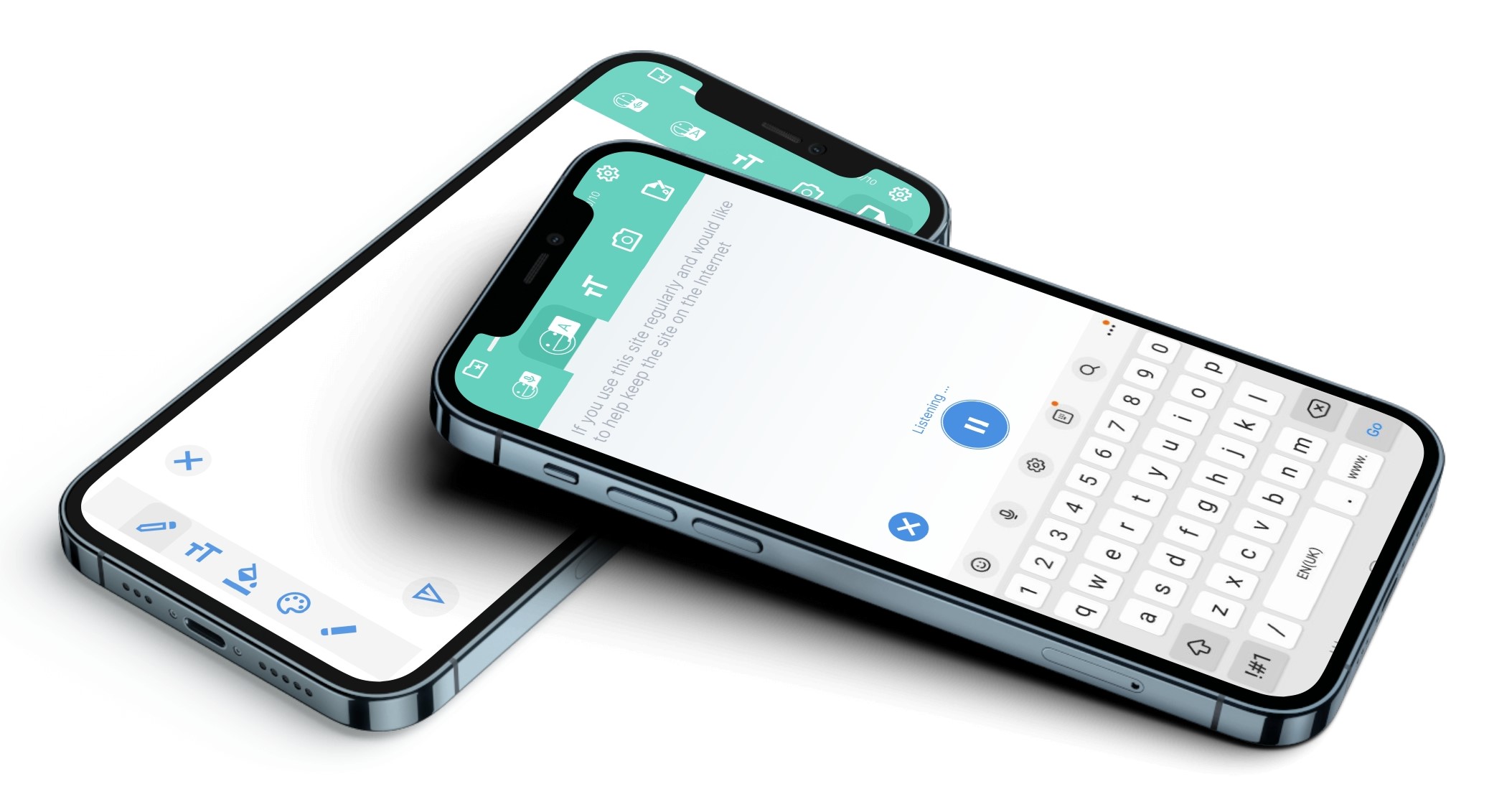
This app version is for both Android and iOS phones and the target group are people who are busy and need a fast solution for taking a memo which can be saved or sent. With that in mind, design will be simpler, but with more control for the user.

The User

During this phase, I did two different analyses: Qualitative - interviewed a small group of 3 users and Quantitative analyse on the internet about earlier user's experience of the VoNo app and note their experiences, feelings and needs when they use this app.

Analyse questions:

Define Phase

In this phase I tried to explore and understand the users' needs, expectations, values and give them the best final product that suit their needs.

Ideate Phase

The user Flow

Journey mapping

Sketch Phase

Wireframe

Based on research and user testing, I created wireframes using Figma. With this wireframe, I have shown the first and initial solution of the future look of the app, which will be able to be tested and to see possible errors before making the prototype.

Mock-Up Phase

Testing Phase

The application was given for testing to several users, and they all stated one of the following things:

Other Projects

Doula app: Redesign and new Monitoring flowFeher d.o.o. UX Case Study and Web DesignImproving Gate Change Notifications