Target Audience: 18 - 65+
Duration: August - November 2022
Tools: Figma, Illustrator, Photoshop, Google forms
Feher d.o.o. is a company with a long history of importing and selling sewing machines. Their request in regard to the website is to improve the User Experience (UX) of their website users, to improve how users can find information, to create a trust for the potential new users, and to attract users attention so they visit them and buy products.
The goal of this project is to develop a clear website where clients can easily find the products they want. To guide them and give them a good user experience. I will investigate who the client is and what her/his needs are.
Feher website has a wide range of products, but that is not the main rule for a good website. Their website needs to improve the scheme of the site so that users can get the desired information and build trust in the company.

This project is to improve how we are giving all information to users, build trust with them, and also attract the users to the company.
User can be every person (working professional, hobbyist, student, housewife) with or without work experience in using sewing machines. The most important thing is that users can easily find all the information about products, brands, technical support, price, buying, and delivery. The main task of the website is to give clear information to users at every moment and on every channel (PC, laptop, tablet, phone), for that reason is important to be optimized for all devices.
Competitive Analytics is a strategy to understand the market position, learn about failures and how to avoid the weaknesses of the current website and making product more desirable.I did research of similar products comparing three websites and seen their strength and weakness.

I did a small online survey with 8 users, to note how they feel and experience when they use the current Feher website, what they need, and what they would like to see when looking for the information.

In this research, I realized how I can understand the user's problems with the existing Feher website, understand their feelings and needs, and improve the new website. In this interview participated 4 persons who used Feher website from time to time, and they explained to me what they needed, liked, and did not like when they used the website.
Here are some of the questions which I used while interviewing the users:


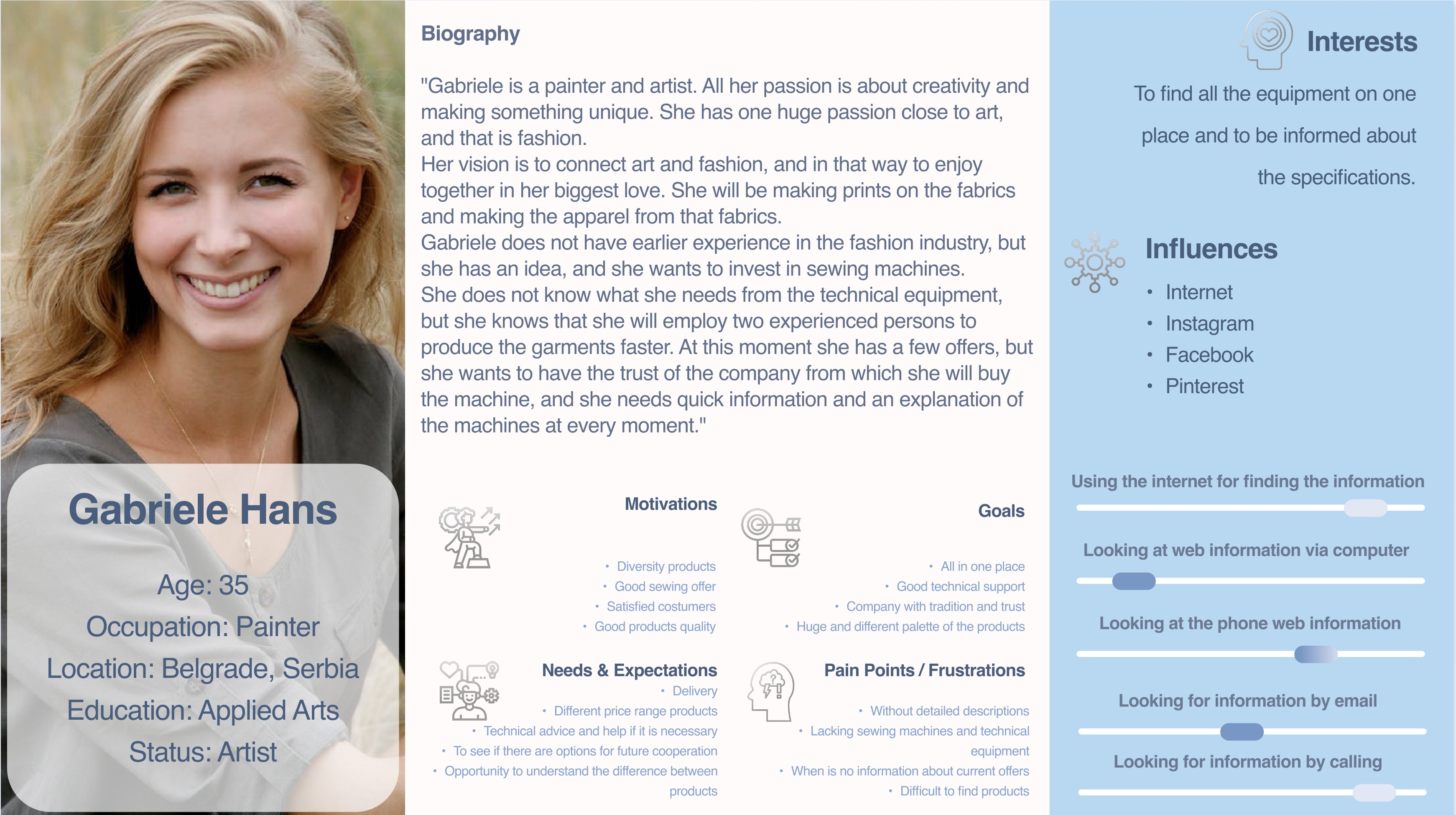
Based on quantitative and qualitative analysis, I created two fictional personas that will represent all the respondent groups who participated in the survey.

 Go to top
HMW (How Might We) questions, will help me find a new idea on what to improve, change or add for a better design.
How might we expedite the search products process?
How might we provide as much information as possible about the product?
How might we enable the user to decide on the product more easily?
How might we create the easiest and fastest way to contact the company?
How might we create the easiest way to send the query for some products?
How might we potentiate users to decide what is the best product for them?
How might we make the user come back for some other products?
How might we gain the trust of the user in the product?
How might we create a clear and easy-to-use UI for clients?
How might we introduce the company to clients and build trust to them?
User flow is the path taken by prototypical users on a website to complete the task. I created this user flow that will show the entry point with a set of steps toward a successful outcome and final actions.
 Go to top
Based on research and user testing, I created wireframes using Figma. With this wireframe, I have shown the first and initial solution of the future look of the site, which will be able to be tested and to see possible errors before making the prototype.
 Go to top
The goal of testing this project is that the user can easily understand the site, that the site can be used by any person, and that users can find all the necessary information. This prototype was tested by 2 persons who participate in the interview in these keys, and they give me their comments:
On the basis of User Research and analysis, I created the final UI design. I would like to present this prototype as a simple but modern design with all the information I have collected as necessary from the users, also with minimal colours in the style of the client. I have also created a mobile version of this design, so I can show the whole package.


After two months - test again the Hi-Fi Design and see if the users have encountered any issues.
Develop the options for online shopping.
Develop the interactive manuals for the products.
Introduce A/B testing for certain pages.
If you like what you see and want to work together, get in touch!
valentinafeher.t@gmail.com